The Third Ugliest Room In the House
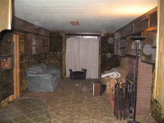
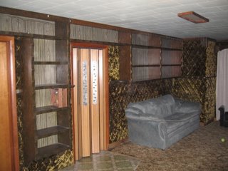
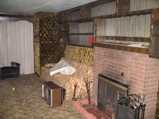
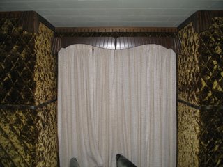 These shots all show one of the most unique (ugly) rooms in This Ugly House. Yes that is some type of upholestry on the walls. I think it's velour. The legend goes is that the original owner saw some custom van interiors done in a similar style and thought that they would look great on the walls in his living room. Thus the Green Room was born (we think the original owner was some sort of swinger in his days...there are mirrors everywhere in the house and this upholesry...shivers). We plan on gutting the entire room including the VERY dark built-in bookshelves and redoing the fireplace somehow. I want to leave some sort of memorial to the way the house was originally and I am trying to convince Trish to let me leave the window area the way it is now. Just trim up the corners and leave the velour upholestry on the walls (I needed to figure out a way to vacuum the walls though).
This room is SO dark. The one window in the room faces south but with the auto body shop next door it gets very little light. There was only one light installed in the ceiling here and it is a paltry 35 watt florescent. So we added some floor lamps that really brighten things up (not that we want to).
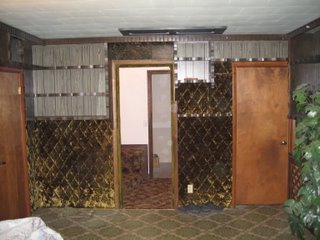
The fourth picture shows the doorway that is the only connection point from the old part of the house to the new part. This really makes the two parts of the house feel VERY separate and we have a plan to change that. When you look at the picture you can see two other doors. The door on the right leads to our temporary bedroom while the door on the left leads to bathroom the size of a telephone booth (pics soon). Basically the plan is remove the entire wall from the door way to the left including the phone booth bathroom. You can barely see the stairs that transition from the old and the new parts in the pic as well. We want to make this like a landing with a railing and stairs. We will try and work something in the home design software we have and post something on it. Trish had to walk me through the design before I finally realized what she had in mind.

1 Comments:
Haha... I told you all there was a reason we called this house ugly. You've only seen the better so far. I have so many wonderful ugly sites to show you people yet...
Post a Comment
<< Home